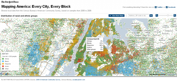
Its been a great start to the week in the world of visualisation with Paul Butler’s terrific design showing some fascinating patterns of Facebook friends and Nathan Yau reminding us of some of the best work that has taken place this year. Now, the New York Times graphics team have joined the party with the stunning project ‘Mapping America‘.
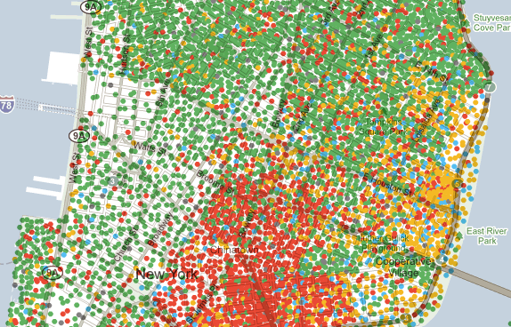
Inspired by the excellent Chicago Boundaries project by Bill Rankin, Matthew Bloch and Shan Carter have created an interactive mapping interface which layers a range of demographic information for every block in every city of America. This creates an amazingly detailed and revealing picture of the diversity of America’s population.
You can choose to display a range of different layers of information relating to race and ethnic distribution, income patterns, housing and domestic matters as well as education subjects.
The brilliance of this work is particularly demonstrated by the dexterity of its interactivity which allows you to smoothly navigate across the country, search for zip codes, zoom in and out to enhance the levels of detail. Helpfully, hovering over individual blocks brings up a dialogue box with specific data for that area.
Congratulations to all involved in this work, it really is exceptional.


