A couple of items of news have popped up this week which give further evidence of the growing mainstream appreciation and appeal of visualisation. The fact both involve the BBC is very encouraging and continues their recent coverage of this subject following their Newsnight programme featuring David McCandless back in August.
The Joy of Stats
The first item regards the announcement of a programme titled ‘The Joy of Stats‘ which is going out next Tuesday 7th at 21:00 on BBC Four:
A documentary which takes viewers on a rollercoaster ride through the wonderful world of statistics to explore the remarkable power they have to change our understanding of the world, presented by superstar boffin Professor Hans Rosling, whose eye-opening, mind-expanding and funny online lectures have made him an international internet legend.
As many have already remarked, we in the UK are very fortunate to be able to see this though no doubt it will be made accessible in some way, shape or form to non-UK followers in due course. I’m sure it will prove to be a great show if the preview clip below is anything to go by.
A couple of grumbles though. Firstly, I always struggle to get my visuals around (if indeed visuals can get around) log scales so I’m a bit concerned that your average punter watching this might be a bit misguided as to how values are progressing along the x-axis. It could also be slightly misleading to the untrained eye that the y-axis does not begin at zero.
Secondly, why can’t descriptions of programmes like this avoid using lazy phrases like “superstar boffin” and observations like “Rosling is a man who revels in the glorious nerdiness of statistics“. This is such patronising rubbish, it really winds me up. Why is it nerdy to be passionate about something? Especially when it is around a subject as important as global health and poverty. Its not like these are particularly advanced examples of statistics anyway. Rant over.
BBC Backstage DataArt
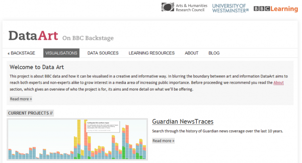
The next item to grab my attention was discovering the BBC’s Data Art project which is an interesting sub-site focused on developing and showcasing examples of innovative visualisations relating to BBC data. The project is a collaboration between BBC Learning Innovation and the Centre for Research in Education, Art and Media (CREAM) at the University of Westminster.

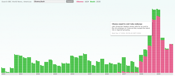
The site contains a range of useful resources, guides and data sources as well as full details behind the development of all the visualisation projects. One example project currently being profiled allows you to compare mentions of certain terms in the news coverage on BBC Americas. For example comparing terms such as Obama vs. Bush produces the display shown below and navigating around this interface leads you to explore the database of specific news items.

