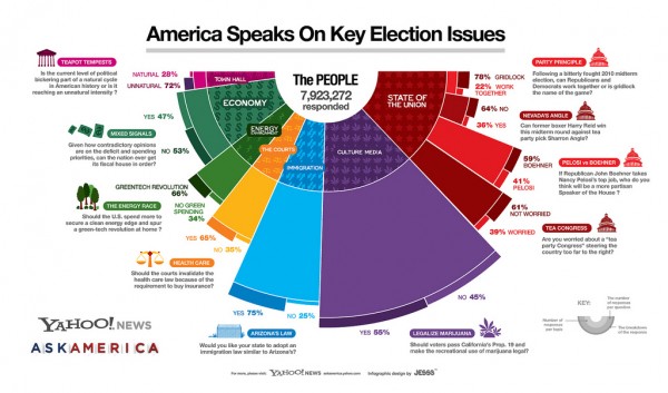
I’ve come across this infographic produced in a collaboration between visualisation studio JESS3 and Yahoo! News Ask America and find it difficult to interpret. This is a shame because the subject matter is clearly interesting and important to many people but it has been presented with a potentially misleading design.

Whilst the graphic scores highly on aesthetics its purpose of accurately and intuitively communicating the data is undermined by a major issue with the graphic. A similar design approach was taken for this interactive GE Health Visualizer which also had a number of issues relating to its ultimately ineffective communication of data.
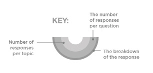
The main problem with this infographic lies with the design comprising a series of different layers: a 180° donut chart, a coxcomb-like diagram and a radial segment graph (whatever that is, made it up). This presents a massive challenge for the brain to take in and interpret each layer simultaneously. Its like being asked to eat a starter, main and dessert all on one plate. On the graphic is a key in the bottom right hand corner to try and explain how each layer works:

The inner layer is a half donut chart representing the % split of respondents to each topic area. Donut charts (the only example on google images I could find below!) are worse than pie charts in that they don’t even reveal the angle to help you formulate the segment interpretations.
You are left with the arc length which is a much less accurate perceptual task. However, whilst it is difficult to interpret accurately, there is essentially nothing inherently misleading about the encoding of this data in this way…
… which can’t be said for the next layer which presents the volume of respondents to each question. The annotation accompanying the launch of the graphic explains how to read this:
The size of each swath of color reflects the number of total responses were received for each topic, from the courts, to the economy, to the state of the union
The main issue with this layer comes down to the fact that the length of the radius encodes the value, when in actual fact the eye interprets the area of the resulting segment, which will inevitably be inflated due to the basic geometry of the shape.
It appears to follow the principle of the coxcomb diagram, made famous by Florence Nightingale. However, the difference is that the coxcomb plots maintain a consistent angle and only the radius is varied. Both approaches, though, maintain the same problems with the resulting segment areas.
The final layer provides a breakdown of the responses to each question. Once again this is a confusing and probably unnecessary extension to the graphic, presented as split radial segments. Could this breakdown not have been included in the presentation of the second layer segments?
Overall, the effect is a far more complicated and potentially confusing graphic that should have been necessary. This is a typical consequence of an approach which aims to squeeze too many variables and data stories into a single graphic structure. Whilst the resulting work may result in a technically clever and aesthetically pleasing solution this often comes at the cost of the fundamental purpose of clearly communicating the data.


