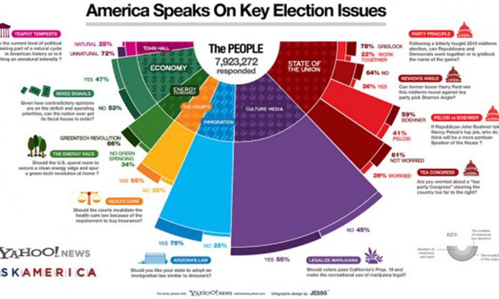
Hard to interpret ‘Ask America’ infographic
I’ve come across this infographic produced in a collaboration between visualisation studio JESS3 and Yahoo! News Ask America and find it difficult to interpret. This is a shame because the subject matter is clearly interesting and important to many people but it has been presented with a potentially misleading design. Whilst the graphic scores highly […]
Hard to interpret ‘Ask America’ infographic Read More »

