The San Francisco Chronicle presents a visualisation developed by Alan Mislove, a researcher at Northwestern University. His study looks at 300 million tweets measuring mood based on the sentiment of the language used. The results are then plotted according to location and time of day. Finally, the volume of tweets are represented by the area of the state in question:
I’ve not seen many visualisations attempted like this before, with the size of regions pulsing to reflect the changing size of a given variable, in this case the volume of tweet. However, I don’t think it works that well at communicating the results or allowing us to explore some of the patterns of data. The coastal bulges are quite interesting but the constant distortion of the country and the states within vastly reduces the chance of drawing insight.
This work prompted me to consider some of the alternative approaches that to plotting multivariate data around issues of geography and time. The following recent examples show possible ideas though, in some cases, they would involve sacrificing the volume of tweets variable.
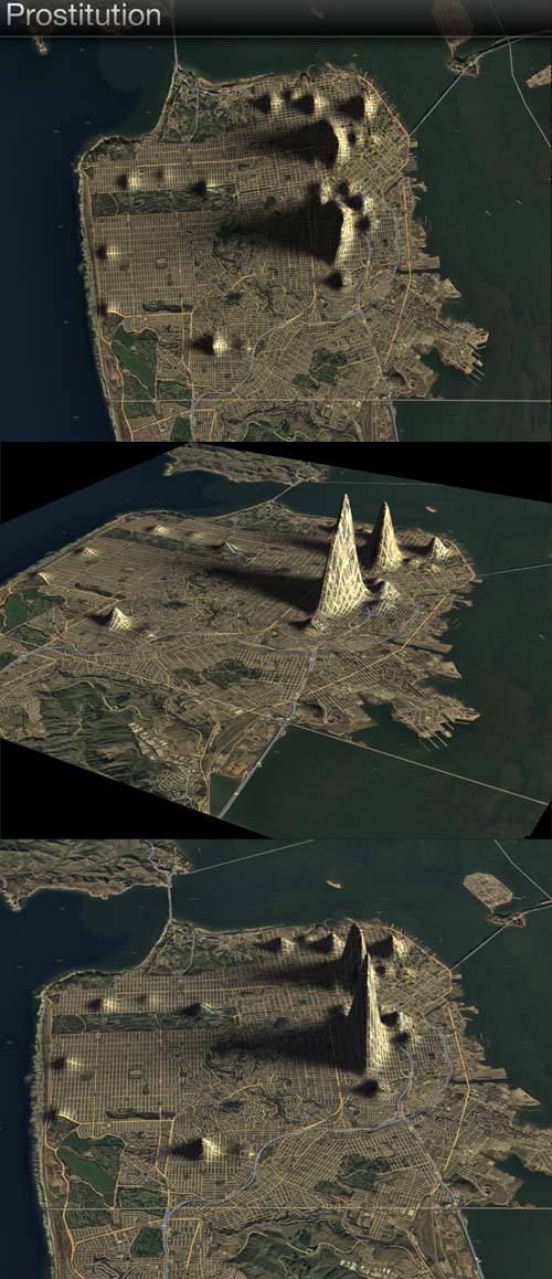
3D Elevated Maps (Doug McCune)
This technique maps 3D elevations to represent the location and prevalence of various crimes on San Francisco. A similar approach could have been applied to the entire US map and the peaks colour coded to represent the mood language and sized to represent volume of tweets. Animated over time these peaks would then grow and shrink accordingly.
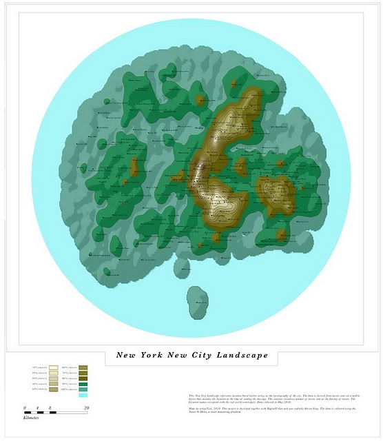
Tweetography (Urban Tick & Digital Urban)
This work plots concepts of new city landscapes based on terrain altitudes representing the volume of twitter activity and styled using a classic cartography look and feel. The colour coding here represents the peaks and so this would in principle change the visualisation of happiness, with volume having to be sacrificed and the height used to represent extent of happiness.
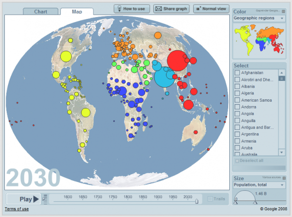
Gapminder (Hans Rosling)
The much celebrated work of Hans Rosling, where multiple variables are plotted over time and by geographical position could be an alternative option, still allowing the use of colour to represent the mood and size of bubbles to show volume of tweets.
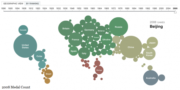
Bubble Map (New York Times)
Similar to the concept of Gapminder but rather than bubbles being plotted over the mid point of countries, here the bubbles are the representations of the geography of each country, growing and shrinking in size over time. This may result in a similarly unsatisfying solution though, as the true geography becomes distorted and therefore hard to interpret.
Twitter Chatter Map (New York Times)
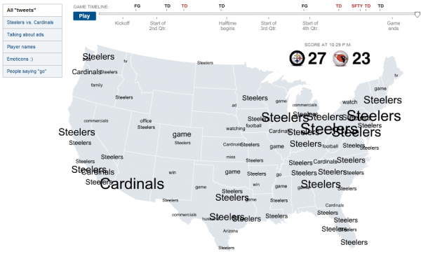
The second representation idea to come from the NYT is the interactive visualisation of the Superbowl and the twitter ‘chatter’ that took place leading up to, during and after the game. This approach plots selected twitter terms across the country over time, growing the size of the text depending on its volume. This perhaps wouldn’t be most suited for the happiness plot for which the values are derived from syntax but not represented by it.
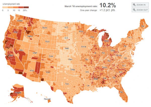
Choropleth/Heat Map (New York Times)
The final technique to consider, once again inspired by an example in the NYT, would sacrifice the volume of tweets variable and simply plot the happiness ‘index’ directly on to the specific locations across the map. The animation would show the changing levels across the states without distorting the geographical accuracy.
It is always nice to see experimental visualisation approaches being adopted to find new ways of communicating qualitative data, especially multivariate data of this nature. Regardless of whether they succeed, it is still extremely valuable work to help further the field overall through better understanding and experience of technique application.

