Access to Data
I have spoken recently about the status of the world of visualisation and how the juxtaposition of a number of factors is really facilitating its growth and popularity, but not yet widespread best practice. One of the key elements in this emergence has been the modern day pursuit for transparency and open access to data which is growing at a rapid pace and is being rewarded with positive action.
We are seeing great progress in this area, and where once we had a trickle, there is now something of a deluge. Government data sites like data.gov (US) and data.gov.uk (UK), the COINS database of UK treasury spending, the Guardian’s datablog, the imminent release of data around UK local government spending and the highly popular Transport for London river, bus and tube data are just some of the examples of this movement.
Accompanying this growing access to important and interesting data comes a great opportunity, responsibility and demand to provide effective visualisation services that act as a window for any interested person or party to be able to explore, make sense of and make use of these great resources.
I recently came across some more of the visualisation services launched in the US such as Recovery.gov, USAspending.gov and the Federal IT Portfolio. Yet, whilst they are a great step in the right direction making the information accessible to a much wider audience, there are things nagging away at me about some of the basic flaws that exist in the design of these services.
Great Expectations
Back in March it was announced Edward Tufte had been appointed on to the Recovery Independent Advisory Panel. This was met with great anticipation within the visualisation community, giving greater prominence to someone like that could only serve to promote and enhance the profile and good practice of the discipline:
Presumably, Tufte will be using his expertise to find charts that illustrate how the stimulus is being used, and what effect its having on the economy. That’s brilliant news, for anyone overwhelmed by the blather surrounding political debates. And it’s not just a token appointment. Tufte says that he’ll be going to Washington several days a month, and teleworking regularly. “Infographics Win! Obama Appoints Data-Viz Demigod to Chart the Stimulus”, Fast Company, 8th March 2010
I concede that my knowledge of the US government is largely informed by the West Wing and so I don’t fully understand the relationships between and alignment of the various councils, departments, panels and bodies. Furthermore, I’m unclear about the role of the department that appears responsible for delivering the spending sites (Chief Information Officer’s Council) nor entirely clear about the potential scope or reach of Tufte’s appointment. However, whilst there are certainly good things amongst these services (eg. the use of gapminder works well) there is a distinct lack of evidence that he has had any design input or influence:
Recovery.gov

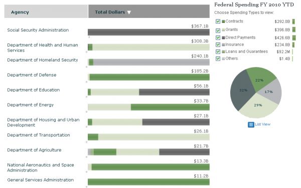
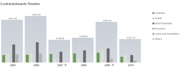
USASpending


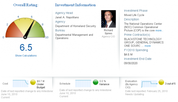
IT.USASpending


The inelegant design of much of the above (especially the ugly tree map and indecipherable USA Spending categorical colour scheme) and the presence of devices like 3D pie charts and gauges does not evoke the Tufte principles many of us take great influence from.
Furthermore, when you hear that the development of the visualisation service for IT spending portfolio cost a total of $8M you start to see it in a new light, especially when you see this summary comment from the same people who were applauding the Data-Viz demigod’s appointment:
Of course, a sophisticated Web site of this magnitude doesn’t come cheap, but it is certainly easy to use… In this case, USASpending.gov’s IT Dashboard is $0.1 million under budget, ahead of schedule by 1.3%, and has an overall rating of 7.5. And the cost to create the USASpending.gov? $8 million, with the dashboard itself costing $1.3 million to build. For this kind of high-tech transparency, I think it’s absolutely worth it. Fast Company article, 14th July 2010.
I’m sure I’ll receive feedback criticising my pedantry with this post but surely we would have expected better?


