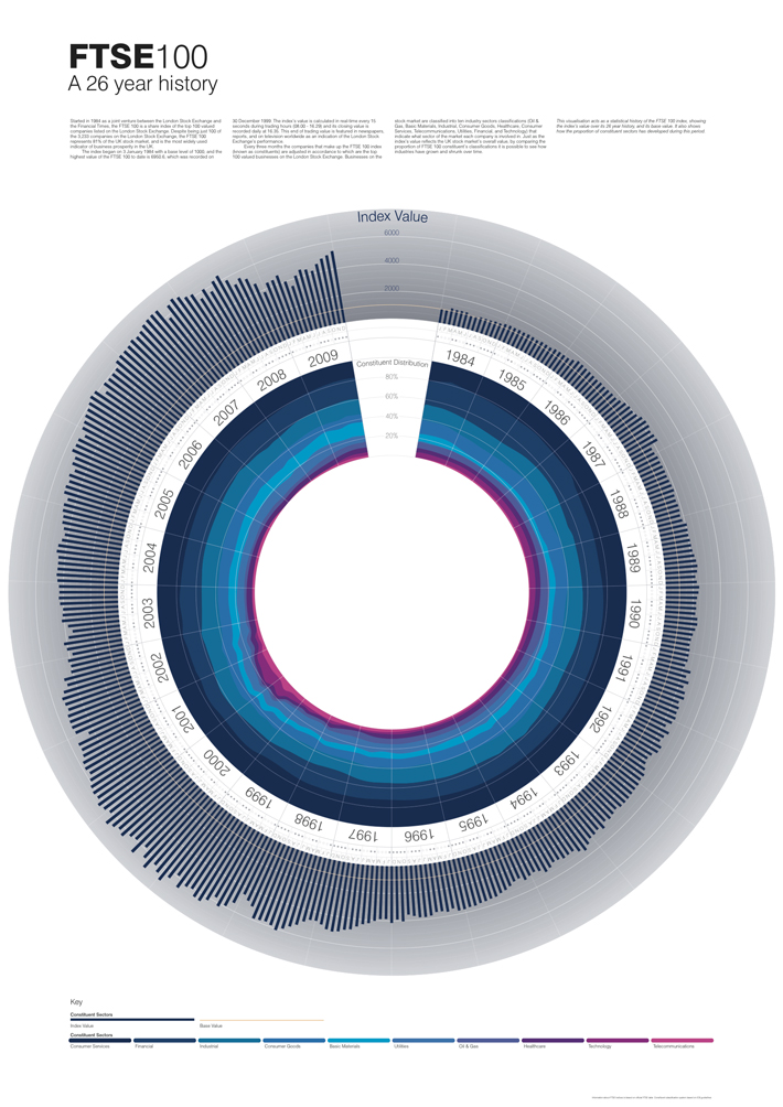
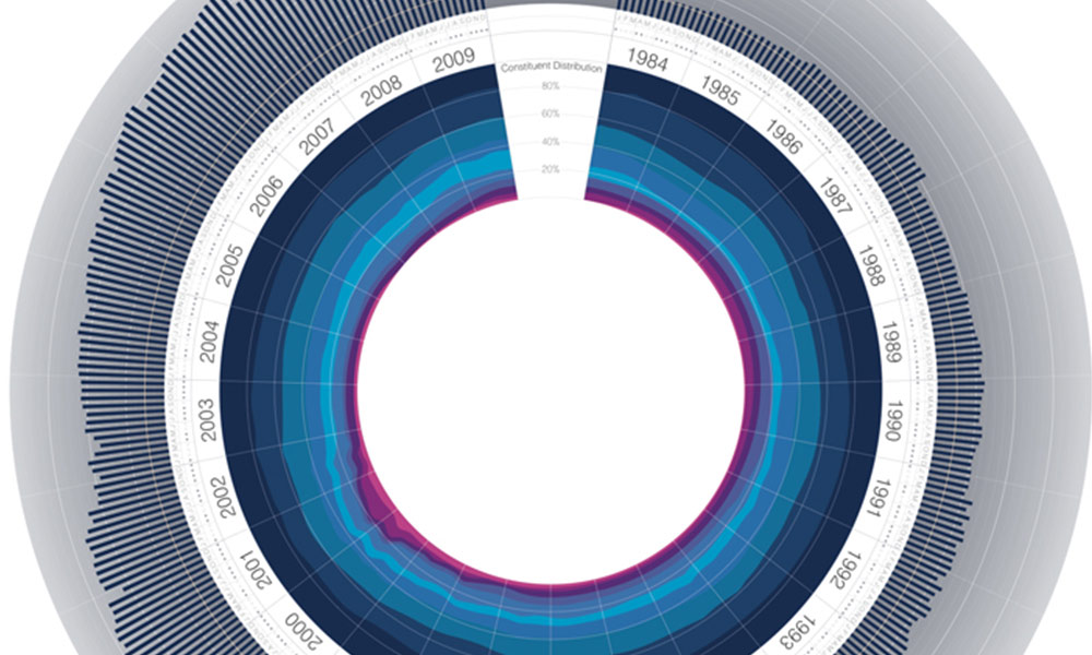
A series of charts by Jeremy Christopher depicting the history, worth and composition of the FTSE 100 share index have been doing the rounds over the past 24 hours (first seen via DataVisualization.ch). The image below is probably the most discussed and shared of this short series of 3 charts. It visualises the FTSE’s index rate for every month over the past 26 years and also shows the changing profile of the industries comprising the 100 most highly capitalised UK companies.

Radial plots are certainly a popular visual device right now (there were several examples in my ‘Visualising the World Cup‘ series) but they are also one of the more contentious visual design choices, certainly amongst purists.
The focus of debate normally surrounds the suitability of plotting a variable (or variables in the case of the similar radar graphs) about a circular axis. Time, however, is a measure that does lend itself to a radial presentation. A logical alternative could have been to disconnect the circle and stretch out the sequence along a traditional left-to-right horizontal layout. However, the compatible layout and proportions offered by a circular display like this (especially when you are trying to comply with the dimensions of ISO paper size formats like A1) is a perfectly understandable choice – it does provide the means to achieve a great deal of data density.
I think this is a wonderfully elegant design, it appeals aesthetically, engages me for a prolonged period and fundamentally communicates the message it was intending – that of the shifting story of the FTSE. There are just a few minor design choices I would have taken differently:
-
The colour scheme used to depict the different industries is pleasing on the eye but offers only very subtle changes between sector which makes it difficult to accurately judge the shifting profile. There is clearly a designer’s desire to minimise the spectrum of colours to sustain the look and feel this diagram achieves but an increase in the distinction between shades would be good.
-
The bars going around the outer band, depicting index rate, create a bit of a moire effect – unintended visual noise. A solution to this would be to reduce the gaps between each bar. Currently, this space looks to be set at 100% of the bar width, so something closer to 25% might prevent the effect.
-
The gradient grey shading in the background of these outer bars is the only ink on the design not encoding a piece of data and, in my view, reduces some of the clarity of these bars. It appears the main function of this shading is to emphasise white major/minor grid lines to help with reading the index value. Perhaps the shading could be removed entirely or at least reduced to a very soft shade of grey and, instead, a subtle but stronger shade of grey used for the grid lines.

