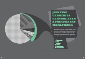
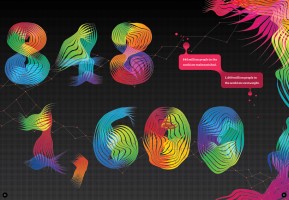
In my recent post ‘Worst graph design ever?’ I provided a very brief review of the ‘The Little Book of Shocking Global Facts’. As the title suggests, this took a critical view of the appropriateness and effectiveness of the design choices made to represent the facts covered.


Clarifying my position
Over the past week there has been a great buzz about this book’s release and it’s probably fair to say a majority have followed a similar opinion to my own, indeed my post has been referred to on quite a few sites. To be fair there have also been staunch defenders of the work so it is important to acknowledge the presence of two sides of the debate. In some cases my opinions have been classified as representing ‘anti-Barnbrook” sentiment and so I wanted to clarify my position.
As far as I’m concerned I have absolutely no anti-Barnbrook feelings, I am simply anti-poor visualisation. I’ve only had passing exposure to Jonathan Barnbrook but it is clear he polarises opinion. That is perfectly normal and expected in a graphic design context where judgements are formed with greater emphasis on the creativity and novelty (by which I mean ‘newness’ rather than gimmickry) of visual presentation. Issues of taste and aesthetic are largely the currency of the debate in this field.
I see things from the slightly different visualisation world rather than the pure graphic design perspective. I therefore judge designs on their ability to effectively and clearly communicate or to enable a reader to explore data in an engaging and useful way. Forming opinions based on the function of clear communication should not be taken to imply that innovation and creativity have no place in visualisation. That is simply not the case. Some supporters of the Barnbrook designs have drawn fearful comparison with a dreaded alternative design approach based on dense numbers and formal statistics and the use of dry, mainstream fonts like Ariel or Times New Roman. Are these the only design possibilities for presenting data? To offer such a binary ‘this or that’ view of the potential of visualisation design is extremely blinkered. But let’s remember that this book is about communicating facts and so creativity in design must aid the communication effect, not impair it.
A response from the designers
DigitalArts have published an interview with Barnbrook designer, Jon Abbott, who offers his views on the research and creative processes as well as the design solutions produced.
The article’s introduction presents an interesting context, particularly in light of the resulting design:
The sheer scale of some of the environmental and social challenges facing the world today can be difficult to wrap your mind around – the amount of data and the massive numbers involved can often seem impenetrable. In The Little Book of Shocking Global Facts, Barnbrook… has cut an experimental line between type art and infographics that allows you to engage with them without robbing them of their power.
With these observations in mind I maintain my belief that the designs fail to achieve such objectives. I’ll leave you to draw your own conclusions from here but will present what I consider to be the most interesting exchange in this interview:
DA: How do you use design and typography to make statistics engaging and make sense of incomprehensibly large numbers?
JA: Aesthetically, our intention was not to create an almanac of information design, but a diverse, fun, richly illustrated book that the reader would want to pick up again and again. We thought that 192 pages of numbers and statistics presented in a formal way could have been slightly dull, so we set about creating something which we thought would be visually stimulating for the reader. We wanted to avoid any visual clichés; some of the numbers are presented in a seemingly abstract way, but all the illustrations have their root in the fact which they are representing.
DA: How how do you stop the design from detracting from the information?
JA: “There have been accusations levelled at the book that our experimental approach impedes the communication of information. Most of the statistics are supported with some explanatory information and it is presented clearly albeit sometimes in an unusual fashion.
Our belief is that a book which is quickly digested is quickly forgotten. I would argue the reader deserves more credit than that, and I think people are willing to take the time to delve into a complex illustration again and again.”

