No, I’m not launching a career in the blues, but as I have done on a couple of occasions in the past, and more for my own benefit than anybody else, I just wanted to capture some thoughts about the status and progress of the site.
Feeds Stats
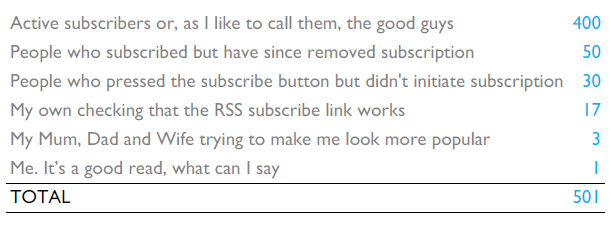
I woke up this morning… and discovered I had achieved the milestone of 501 feed subscribers. I’m delighted to have reached this volume so quickly given that I only commenced blogging from a standing start in February. I am, however, realistic about the accuracy and reliability of feed stats and so decided to hypothesise about the likely detail behind this headline figure.

A massive thank you to all of you who have requested an RSS subscription and especially you 400 heroes who possibly still keep an eye out for my posts.
Serving Suggestions
Without wishing to come across like one of those sections you get on food packaging that provide groundbreaking advice like cereal is best served with milk, in a bowl and eaten with a spoon, I wanted to clarify some of the different ways you can consume, engage and interact with all things to do with the Visualising Data world:
RSS Feed
I have already talked about feeds but for those who may not be familiar with RSS it is a way of avoiding having to regularly visit sites to check for any updates. By subscribing to RSS feeds, and through the use of an RSS reader, you can collate and view instant updates from your favourite sites as soon as they are published. To read or add comments, however, you must actually visit the native web site.
As well as being an alternative, convenient source for receiving alerts and links to new posts, this month I have stepped up my use of twitter by also sharing additional content about wider design, communication and technology issues that I find interesting. These, typically, are items I don’t feel warrant a full blog post as there’s probably not much more I can or wish to add to the source information. I will interact on Twitter as much as possible with my followers but don’t follow me if you want to know if I enjoyed my dinner, what my favourite humming noise is or my views on monkeys wearing clothes.
At the moment the Facebook page only presents blog posts on the wall and to read them you are pointed back to the main site anyway. My current intention is not to use Facebook as an interaction platform. However, to make it worthwhile for people to ‘fan’ me, I am trying to replicate the additional content that I now provide to Twitter followers by establishing a link between Twitter and Facebook. As yet, this has not been successful but I will persist…
www.visualisingdata.com
It goes without saying that this is the engine room behind all my principle content, giving you a convenient platform to view recent posts, popular posts (widget imminent), view archives and also take up my services, should you wish. Additionally it is the best place for readers to leave feedback through post comments. I will always try to acknowledge or respond to those who take the time to respond to an item. I have added a Twitter widget on the sidebar as a route into the additional content I’m sharing on there.
Whilst many sites are probably so over-subscribed with visitors that they can’t realistically stay on top of email communications, I’m not at that stage so please feel free to email me about anything to do with the world of visualisation.
World Cup Posts
Thanks to the many readers, visitors, retweeters and referrals who have helped generate such a volume of interest in my two posts about ‘Visualising the World Cup’ (part 1, part 2).
Having (seemingly) avoided the curse of the sequel I was reluctant to risk the almost inevitable failure of threequel. However, I have unearthed a number of further interesting visualisation examples and have benefited from suggestions from commenters and emailers so I am going to publish a third instalment in the next week.
To really bring added interest to this third piece I would really like to find visualisations from further afield. I’m particularly drawn to the geography of the World Cup itself and having had great examples from England, US, Spain, Portugal, Brazil, Germany, Holland, Chile, Switzerland and South Korea, I would love to discover designs from as many of the other competing countries and regions as possible.
So if you are in France, Mexico, South Africa, Uruguay, Greece, Argentina, Nigeria, Algeria, Slovenia, Australia, Denmark, Cameroon, Japan, Italy, Paraguay, New Zealand, Slovakia, Ivory Coast or Honduras, please let me have your links and suggestions!
General Site Matters
I’m sure I’m not alone in the world of blogging in finding the appropriate and useful allocation of tags and post categories difficult to get right. The rule of thumb I started out with in February has now totally fallen by the wayside and has left the tag clouds and category navigation a disproportionate, useless mess. If anyone has any links to useful articles about good practice in this area do let me know, otherwise I’ll soon embark on the painstaking process of revisiting every post and starting a fresh approach.
Thanks for reading and take care.

