Via The Big Picture website I’ve come across a New York Times graphic sequence explaining the national debt levels across European states. The sequence presents seven different graphics that build a story of the debt crisis across the continent and I want to comment on a couple of aspects of these displays which I feel undermine its effectiveness.
Colour scheme
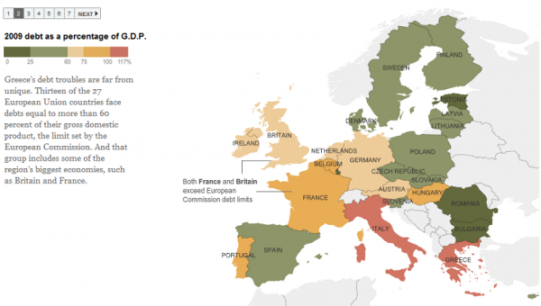
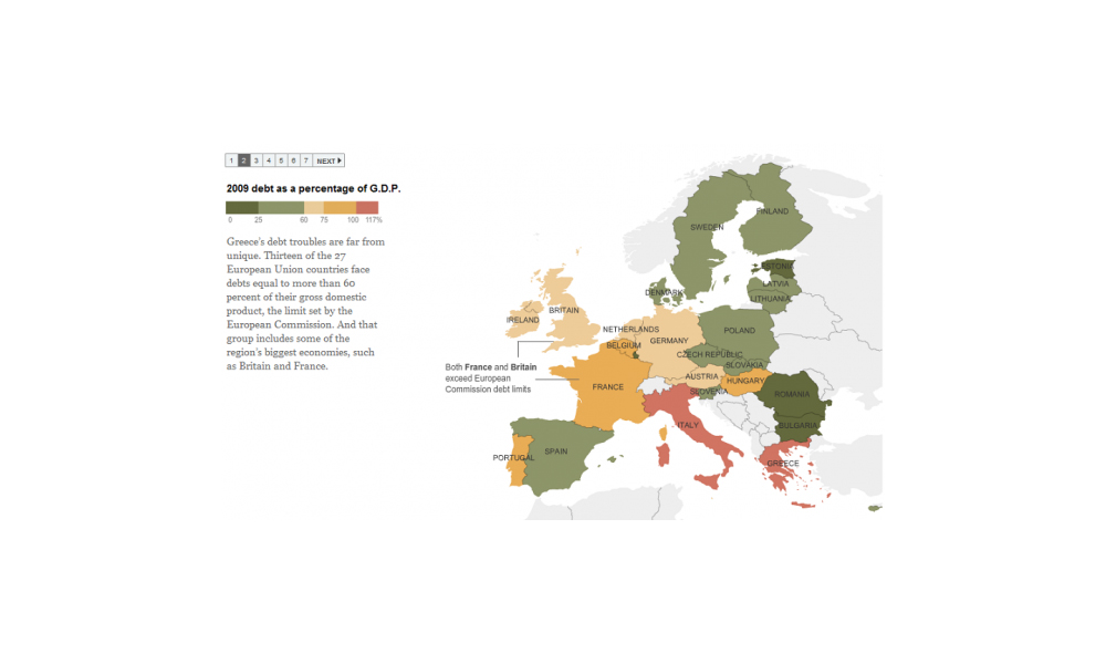
My first issue relates to the colour schemes used to encode the value ranges. As you can see in the graphic below the coloured value ranges begin with a dark green and end with a shade of red. Whilst I understand the implication of these choices (green = good, red = bad) the resulting display, in my opinion, doesn’t efficiently help the viewer pick out the true message of debt/GDP % levels across the countries.
This is because the visual representation of the lower value levels (in dark green and the murky pea-soup colour) actually creates a stronger emphasis than the higher debt/GDP % level band 60-75% which has a much more subtle, pale sandstone colour. This creates an instinctive impression that the 60-75% range is somehow of least important and lowest value when in fact it is neither. This causes an unnecessary amount of cross-referencing with the legend key. A more effective approach would have been to have use a single colour with decreasing shade bands for each value range. This would enable the viewer to more naturally pick out the prominence of each country in relation to the size of their debt/GDP %.

Inconsistent colours
A further observation about this matter concerns the inconsistency of colour ranges used in the graphics across this series. This creates creates an unnecessary amount of re-familiarisation with each graphic display and associated legend key and so interrupts the process of learning at each stage.
8-bit graphics
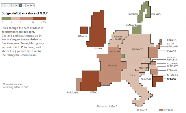
My other issue concerns the attempt to present the countries in revised shapes and sizes according to their GDP with the colour relating to the budget deficit share (example below). Put simply, I just don’t think this works well at all. It reminds me of playing Daley Thompson’s Decathlon on the Commodore 64 in the 80’s. It looks clunky and is very awkward to read. For this presentation I would have dropped the attempt to sustain a geographical relationship and instead focus just on the two variables of GDP size and budget deficit %.


