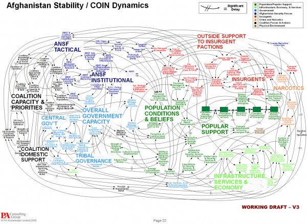
There has already been a great deal of coverage across visualisation-related blogs and news sites about the reaction of General McChrystal, the leader of American and NATO forces in Afghanistan, to a slide he was was presented portraying the complexity of American military strategy. I can’t avoid the temptation to add my own contribution to this debate.
Here is an image of the slide in question, click on it and zoom to see the bigger version:
Time for a rant
The focus of the coverage has been on Gen. McChrystal’s quote “When we understand that slide, we’ll have won the war” using it as a further example of the curse of PowerPoint. The New York Times article, in particular, has used this incident to stick the boot in somewhat, reeling out an array of examples of how senior military commanders deride Powerpoint.
This is typical of the ridiculous, misplaced negative sentiment that exists towards PowerPoint, blaming the tool rather than the craft (presentation design) or the craftsman (the PowerPoint designer). Is it PowerPoint’s fault that people use terrible cliparts? Or thousands of bullets? Or dumb background templates? Or useless transitions and animations? Is it my hammer and drill’s fault that I’m rubbish at DIY? No.
It is at least refreshing to see a large proportion of post comments across the web trying to make this very point. However, there are still far too many people out there who totally miss this point and lazily jump on the bandwagon – probably being driven by Edward Tufte (though at least he was willing to backup his opinions).
My experience of the death-by-PowerPoint merchants in the workplace is they tend to be the ones who generally dabble in comedy Friday ties, leave post-it notes in office kitchens complaining that someone used their milk (because they had drawn a line where the level was when they last used it) and they always seem to schedule meetings for 9am.
Of course PowerPoint has it’s flaws and, as with Excel charts, the defaults, templates and wizards are generally awful. But if you look past this you will find a superbly useful piece of software. There are alternatives, such as Keynote and more recently Prezi (which I’m going to discuss in a separate post), but the key issue is the significant lack of capability in being able to present information and communicate effectively.
Assessing the slide
Data + Message + Display is a simplified formula that explains the key components of effective visualisation. In this example, the data was clearly available with regards to the activities, nodes and relationships of this situation. With my OR hat on, the display chosen, a cognitive map/system dynamics diagram, is a common approach to presenting complex situations like this. And it is the words ‘complex situation’ that are important here because the purpose of this presentation was to present the complexity of American military strategy. This was the message and therefore the display largely succeeds. There’s no doubt the actual execution of the display could have been improved significantly – such as reducing the visibility of the lines, being consistent with the nodes as text labels or boxed labels rather than mixing both, and finding a better way to position the bold category titles (if you look closely they actually sit on and obscure key nodes on the diagram) – but fundamentally the data, the message and the display are coherent.
If you wanted to explore the detail this wouldn’t work, you would need a reduction in the complexity by breaking down the system map into more digestible thematic clusters. Perhaps the senior military officers bemoaning this slide should think back to what they actually commissioned.
End of rant.
Now who’s been using my milk…


