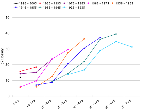
Another interesting challenge presented by Nathan at FlowingData to improve the design and clarity of message of the graph presented below which displays the results of a study investigating obesity rates at different ages across people who were born in different cohorts of years.

The primary difficulty in using this display is the problem caused by having to decode eight line graph series which represents the various year of birth cohorts. As Nathan comments, you can eventually adjust your reading ability to draw some insights from this graph, though it does require a multi-slide presentation to truly impart the key messages.
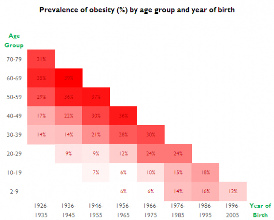
My re-working below simply takes the raw data, moves the year of birth categorical values on to the x-axis and then applies Excel’s cell conditional formatting to present a colour pattern of obesity rates from 40% (darkest red) down to 0% (pure white). I have used a single hue with changing tints towards white as this helps our visual system to better judge a decreasing value. I have left the original values in the cells for two reasons – firstly, I can’t for the life of me remember how to switch them off and, secondly, I actually think they add an extra layer of potential insight being able to reference key values when explaining the insight from this study.


