With the UK election process very much reaching its peak in terms of anticipation, discussion, debate and spin I thought I’d follow up my earlier post, which introduced some of the quantitative analysis and interactive scenario tools, to present some examples of qualitative analysis. This area of visualisation is rapidly growing in prominence as media outlets exploit the incredibly rich source of opinion and discussion services such as Twitter can provide.
BBC Sentiment Tracker
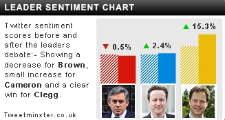
In partnership with Lexaltyics, this is the BBC’s graphic for tracking the sentiment of Twitter users towards the three party leaders during the course of the live TV debates. The magnitude and direction of the sentiment scores are generated by algorithms which assess the nature of the language being used about each party/leader. Of course this is not an exact science and the results should be taking with a large pinch of salt, particularly as they are vulnerable to ironic abstractions such as the ‘its all Nick Clegg’s fault‘ campaign…
The graph below is taken from last week’s second debate event on Sky News.
![]()
Assessing the graph reveals a number of flaws. Apart from the annoying title, logo and the clumsy positioning of the legend key, the main problem is the lack of prominence of the ‘zero’ line which divides the sentiment into a positive or negative direction. There is little or no visual prominence afforded to this and it is made more ambiguous by the useless banded shading. For some reason the vertical axis goes up to 9 when there is no value much over 3 and the minimum value range is -6 which creates a visual inbalance. I also think there is a missed opportunity to aid insight by neglecting to provide useful context. Annotating the timeline to highlight the milestone moments of each question being asked would have been far more useful than just seeing the time across the x-axis. This would facilitate interesting analysis of how each leader was perceived to have performed on each question.
Tweetminster
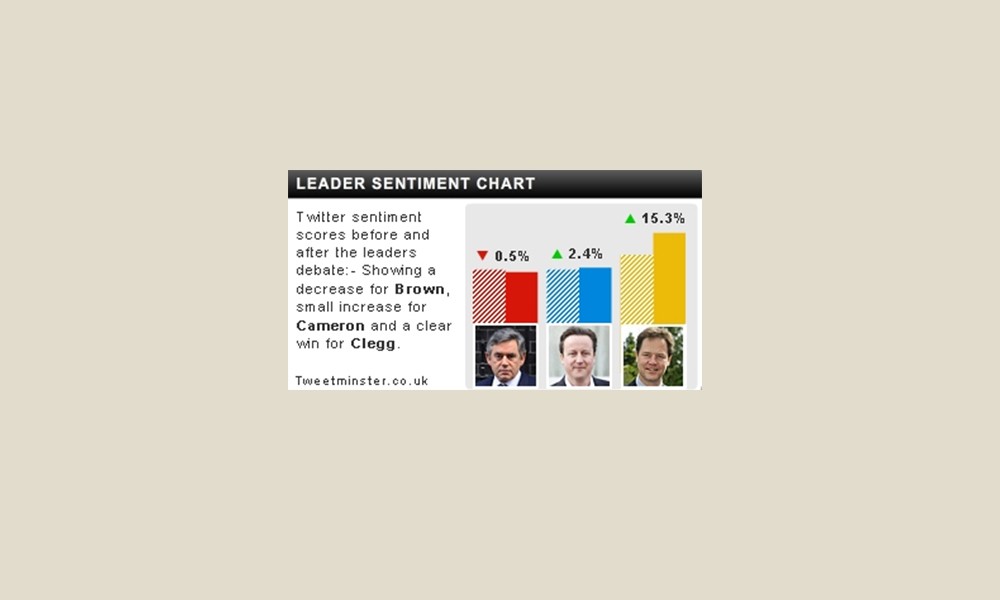
An alternative approach to assessing sentiment is offered by Tweetminster. As well as collecting and collating sentiment scores based on language, Tweetminster’s flagship analysis focuses on the volume of mentions and references made about constituencies and candidates, creating a buzz/word-of-mouth assessment to form predictions for the eventual election results for each party.

![]()
The Slapometer
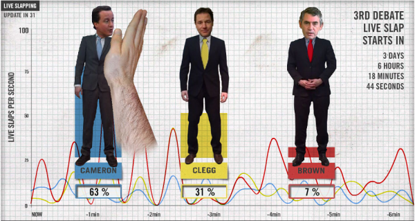
We’ve had analysis of who is mentioned in most positive terms, who is talked about the most and now we have who we’d most like to slap via the Slapometer which allows site visitors to vote with the back of their hand.

With all the complicated and advanced algorithms and data gathering devices represented by all the other devices presented here and in my previous posts, could it be that this crude data collection approach will prove the most reliable? We’ll have to wait and see…

