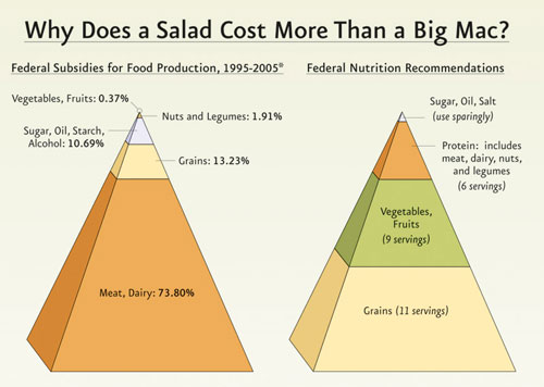
Nathan from FlowingData has published a post today which sets out a challenge to rework the graphic below, produced by the Physicians Committee for Responsible Medicine (PCRM) to present a comparison between Federal subsidies for food production and recommended nutritional servings.

The intention of this graph is to show just how out of sync the spending is with the nutrition recommendations, but this design completely fails to present this clearly to the reader. To start with you’ve got the 3D pyramids which make the task of accurately reading the values virtually impossible. You’ve then got the issue of the values within each pyramid being ranked by size rather than a convenient ordering of food types to allow at least some comparison. Furthermore, the food subsidies has meat and dairy separated from nuts and legumes, whereas the nutritional recommendations combine these into a single ‘protein’ group. I could go on with issues like the value labels on the left pyramid standing out in bold but the ‘serving’ labels on the right are not which creates more work for the eye, but I’ll leave it at that.
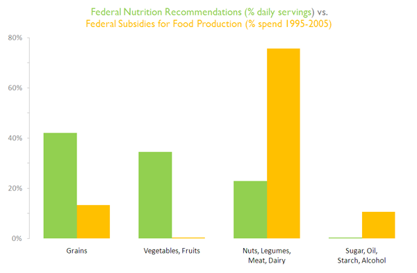
So how could it be redesigned? Here are a few alternatives that I’ve quickly put together.


The first two were done using Excel, the last one was done using Tableau.
The first task was to standardise the data into comparable units so the food type values now represent % of food subsidies and % of recommended daily servings. I then made the food type groupings consistent by merging the meat and dairy values with the nuts and legumes values for food subsidies. These graphs now provide an opportunity for direct, clear comparison between the two sets of values. Some further design thoughts:
-
I couldn’t decide between the column or bar approach. The food type labels were quite long so the space afforded by the bar graph for the axis labels appealed. In Tableau, the horizontal design failed to show up the small % values of some of the items.
-
I combined the title with the legend to save on duplication and space
-
I used Gill Sans font for text because it is nice and clear and I like it at the moment (particularly in its use on the classic Penguin book designs)
-
The numbers are in Calibri font
-
I used earthy colours green and orange because I felt they were consistent with the nature of the topic
-
The values are sorted in descending order based on the nutrition recommendation %.

