How Much Information? is a report published by academics from the Global Information Industry Center, University of California, San Diego. Released in December 2009 it presents the results and analysis of a project aimed at creating a census of the world’s data and information consumption during 2008. It asks questions such as how much did people consume, of what types, and where did it go?
The headline findings reveal that the speed of modern life can be measured at 2.3 words per second and, during a typical day, we consume (not necessarily read, but take in) about 100,000 words a day through emails, internet, TV, text messages, reading and all sorts of other media. Additionally, considering the amount of image, video and audio we are exposed to, we process about 34 gigabytes of information each day.
This provides great evidence about the absolute necessity for improving skills around information and communication design to help modern day consumers of information process this as efficiently and as effectively as possible.
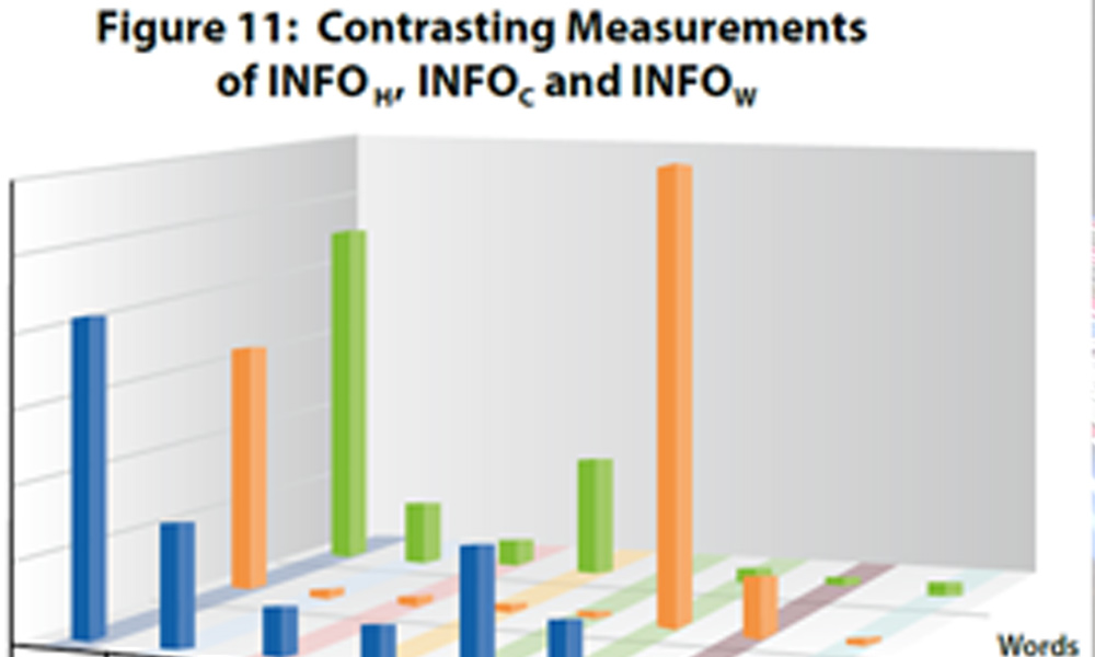
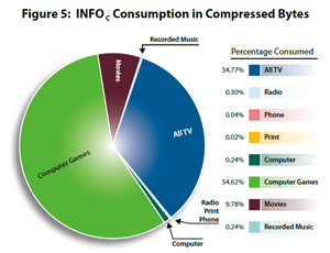
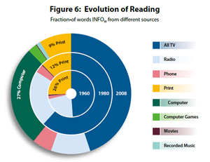
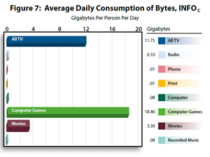
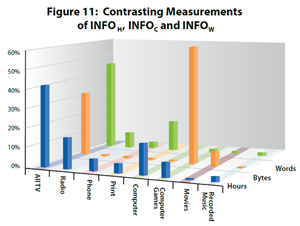
However, it is a shame that the design of the graphs included in this report to present some of the analysis employ largely ineffective and over-decorated design principles. The displays below represent the worst offenders. They demonstrate overuse of colour, inappropriate selection of graph type, unnecessary shading and distorting use of third dimension which requires the reader to exert far too much time and effort to draw any worthwhile insight from. Not much help when we’re clearly already overloaded by data and information.
Click here for the ‘How Much Information’ project home page, and click here for the author’s blog.

