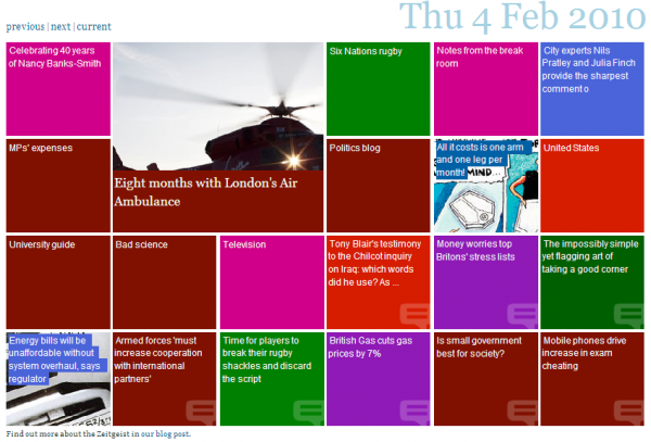
The Guardian website has launched Zeitgeist, “a new way to reveal and explore content on the Guardian site, according to ‘social signals’ from users“.
It presents a dynamic, alternative interface for navigating to content from across the site and is, in simple terms, based on the more popular items of the day. This offers a different perspective to the organisation and presentation of news that would be typically led by an Editor – this is the user’s shaping the news agenda (“a mirror of attention“).
The Guardian is quite an innovative, cutting edge, media outlet, certainly when compared to other newspapers and they have a design-savvy brand, reflected by their unique ‘Berliner’ paper layout and their largely effective web design. Their iPhone app has been a great development and has helped to position themselves ahead of other newspapers in the race to find new, creative but effective channels for revenue. Furthermore, from my area of interest, the award-winning graphics team frequently produces excellent infographics to support news items.
The Zeitgeist designers stress that this is an experiment and one that is certainly incomplete and I think it does show. There doesn’t seem to be anything wrong with the methodology or algorithms the designers have established to determine the content items – variation from norm rather than absolute popularity, and within-section comparisons.
I guess the main reservation I have is the capability of the interface. It is easily overshadowed by existing developments such as something like Newsmap, which has a similar purpose, organising popular news items generated from the web, but presents this in a more effective and more versatile treemap design. The treemap approach gives you a greater sense of relative popularity (rather than the somewhat binary ‘popular, or not’) and also has far more scope for providing information (and therefore navigation) to a larger volume of stories in the same space. The Zeitgeist layout provides room for only 21 content boxes which limits the range and number of subjects presented. In time, if and when it establishes a large proportion of users, it also may serve to perpetuate the existing popularity of the visible stories.
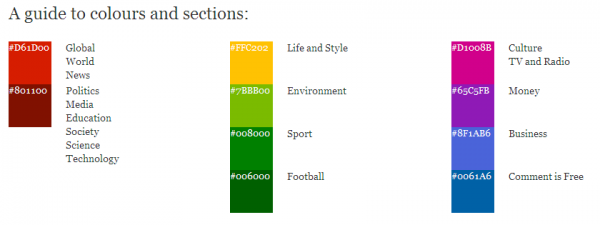
Another aspect that lets it down at the moment is the legend which tries to help users understand the subject area/newspaper section each colour-coded content ‘box’ relates to. It takes up a lot of space, isn’t particularly simple to follow and accordingly feels a bit clunky.
As I have said earlier, the designers are clearly transparent about its experimental nature and that it is only the early stages in its live development so hopefully it will continue to evolve into something that leads news interface innovation rather than slightly lags behind.
More information about Zeitgeist can be found here.


