A couple of weeks ago I launched a second contest inviting people to send me examples of their best worst visualisation work. It had to be their work, though, not just submissions of bad visualisations they’ve seen elsewhere. The winner would receive a free copy of my upcoming book as soon as it is published. The contest closed on Sunday and I’ve now had chance to judge the entries.
As with last month’s graphiti contest, picking a winner was ever so hard with lots of wonderfully bad work heading my way. The submissions generally fell into two different camps: (1) the most blatant, inelegant in-your-face explosions of design awfulness, and (2) the more subtly deceptive “wolf in sheep’s clothing” designs. My judgments were based on the degree of violation against each of my three key principles: Trustworthy, accessible and elegant.
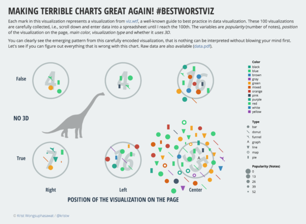
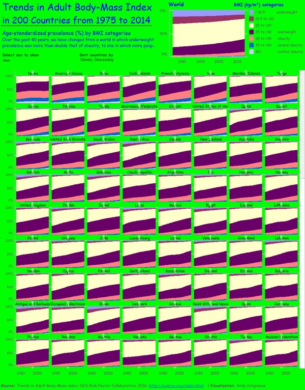
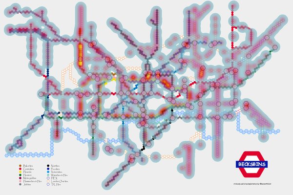
I reduced the list down to a core group of finalists from which I eventually selected Krist Wongsuphasawat’s submission. Not only was it seemingly trustworthy but entirely dripping with bad practices, not only was it based on analysis of data from WTF Viz, it was also substantiated with a wonderfully detailed process narrative. Congratulations Krist!
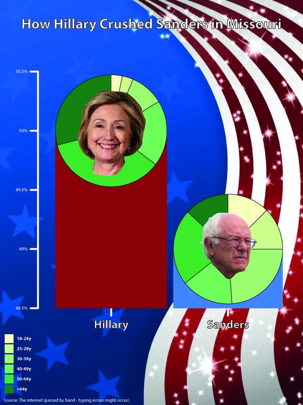
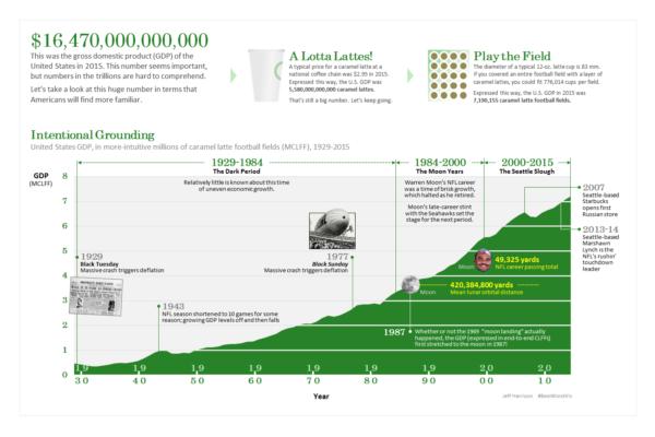
Special mentions to two submissions that ran Krist very close, Thomas Pedersen with his eye-stabblingly horrible ‘bar-pies’ and Jeff Harrison who offered a very clever, seemingly trustworthy, elegantly executed pile of nonsense (give it a good read to find the frequent wrong-ness).
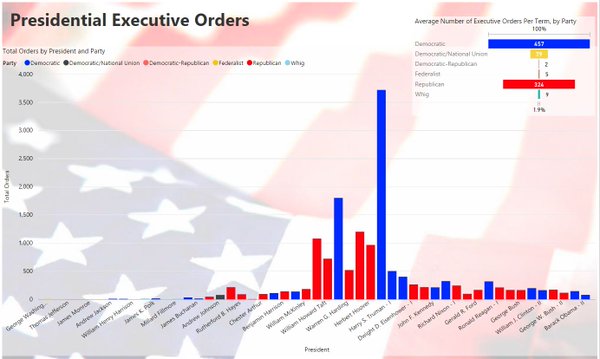
Thomas Pedersen (My oh my, Miss American Pie)
Jeff Harrison (A really gross domestic product)
A huge thank you to everyone else who entered their bad work, I could have made arguments for all entries to be chosen as the worst but, as always, there must be a winner. For those who missed out on this occasion, I will be running a third and final contest at the start of May that will again tap in to some different creative sensibilities… In the meantime, here’s the rest of the gallery of submissions.
Camille
Dave
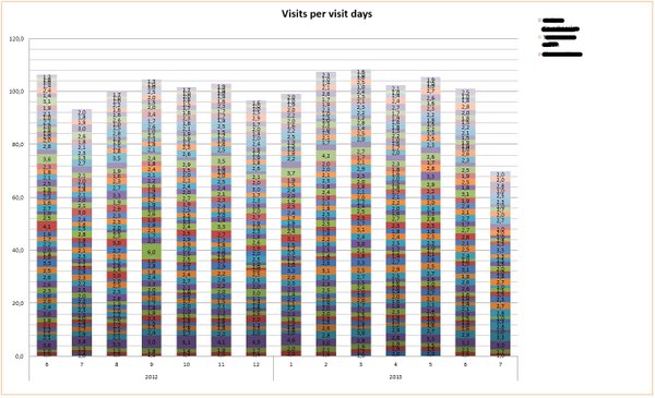
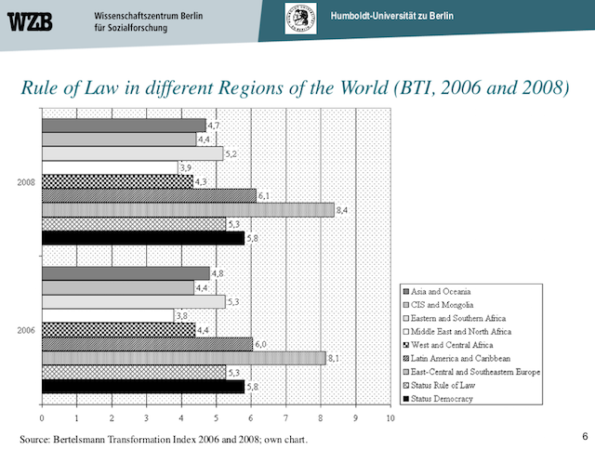
Dag Tanneberg (who stated this graph was “actually used during the early steps of Myanmar’s ongoing transition to democracy”)
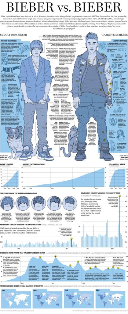
Richard Johnson (Nice try Richard but you know you loved working on this piece and there’s no way I can risk awarding this the prize as the worst graphic because I’ll then have 80M ‘beliebers’ bombard me with teenage hate!)


