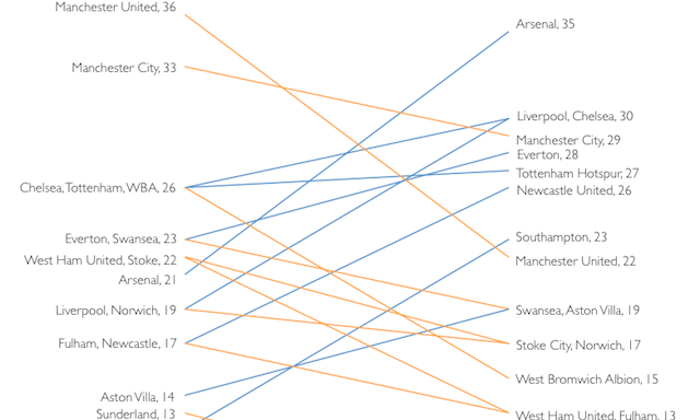
I love slopegraphs. I’m happy to nail my colours to the mast and declare it. I’d probably not go as far as to wear a t-shirt with such a slogan but I feel a need to express my praise for the still-underused slopegraph and try help continue spread the word of its worth.
The typical application for using a slopegraph is for a before and after story. Its key value is that it provides several lines of interrogation in one single chart, revealing ranking, magnitude and changes over time.
As a big football fan, this is a particularly interesting time to apply a slopegraph to show the huge amount of transition that has taken place in the Premier League between this season and last.
So far teams have played 15 games. A snapshot of the league tables after 15 games for this season versus last let’s us look at the data and pick out the headline changes in the position of teams in the league and their absolute points,. We can see Arsenal are up at the top of the league having been mid-table last year, as are Liverpool. We can see (and take some delight) in Man Utd’s drop towards mid-table mediocrity but yet they aren’t loads of points away from the precious top 4. We can see Sunderland’s ongoing struggles.
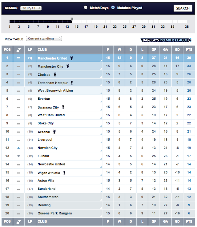
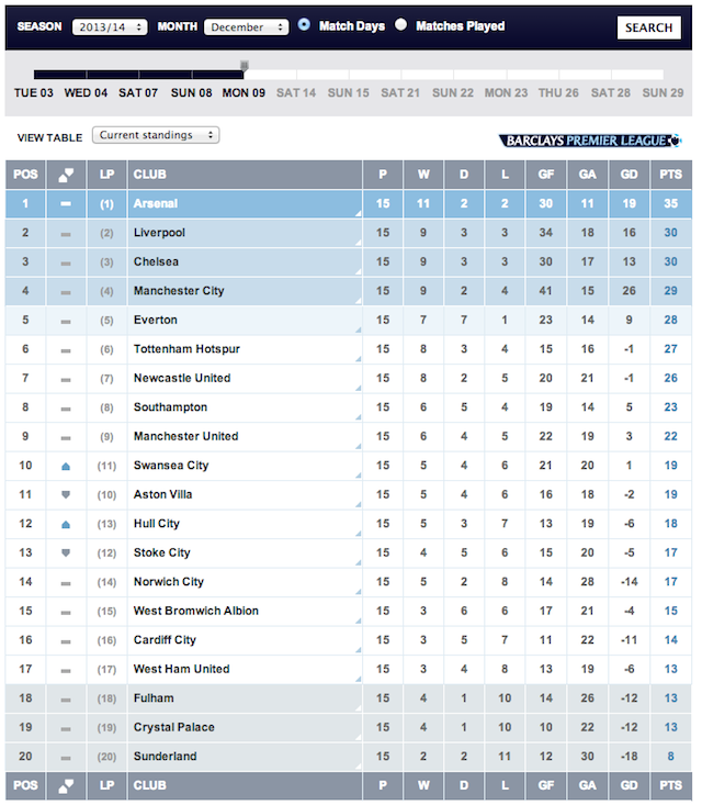
However, it doesn’t satisfactorily draw out the big changes that have happened. The best way to visually expose the big stories of these two contrasting seasons is with the slopegraph. Using data from the official Premier League tables for 2012/2013 (as at 15 games, with manual adjustments for those who hadn’t reached 15) and 2013/2014 (as at 15 games played) we can use something as simple and ubiquitous as Excel to create a simple before and after story. (Note that I have removed the relegated/promoted teams, just using those that were in the league across both seasons.)
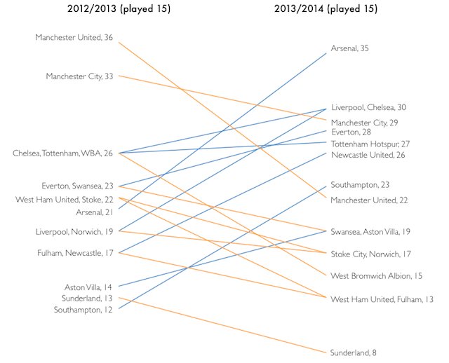
Now we can see the stories. Plotting the teams by absolute points totals on the parallel vertical axes automatically encodes their ranking with connecting lines joining the points together highlighting the transition (colour accentuating the up and down movement).
First of all we notice there are clearly big changes, the sloping lines in all directions tell us this instantly. We see how boringly dominant the two Manchester teams were at this point last season: the physical gap between City and third place much more apparent than from the table view. We see Arsenal’s impressive standing, 5 points clear already, and the relative bunching of teams competing for the top places beneath. We see not just Arsenal’s and Liverpool’s rise up the table but the significance of that rise compared to their relative performances at the same stage last year, as it is for Newcastle and Southampton.
To further emphasise the bigger changes up and down we could use the darkness/lightness of colour to visually distinguish those who have gone up or down by 25%+ of their points totals.
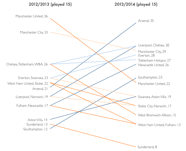
Alternatively, we could use the thickness of the connecting line to emphasise this (which might be better for small resolution graphics).
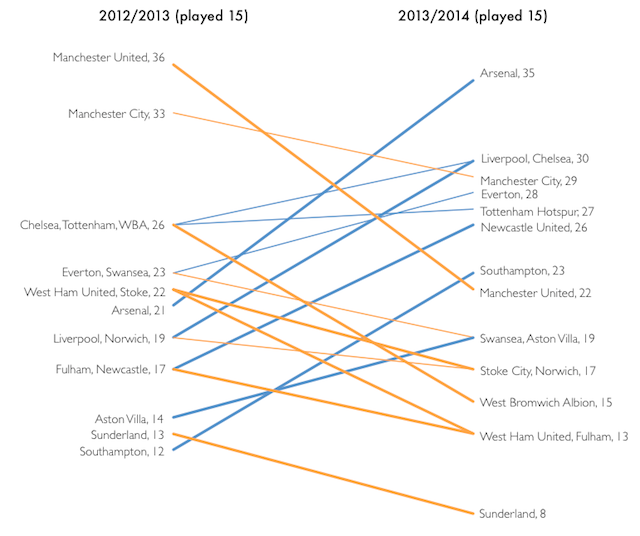
Just a simple demonstration but something that should show the value of a slopegraph in offering multiple insights from a single and simple graphic display. I would love to see this technique being used more, especially in the sports broadcast media, where it could be perfectly deployed.

