
Advocating vs. benefiting
Having immersed myself in the world of data visualisation through research and practice over the past 3 to 4 years, it’s emergence and continued growth is very clear for me to witness.
Advocating vs. benefiting Read More »

Having immersed myself in the world of data visualisation through research and practice over the past 3 to 4 years, it’s emergence and continued growth is very clear for me to witness.
Advocating vs. benefiting Read More »
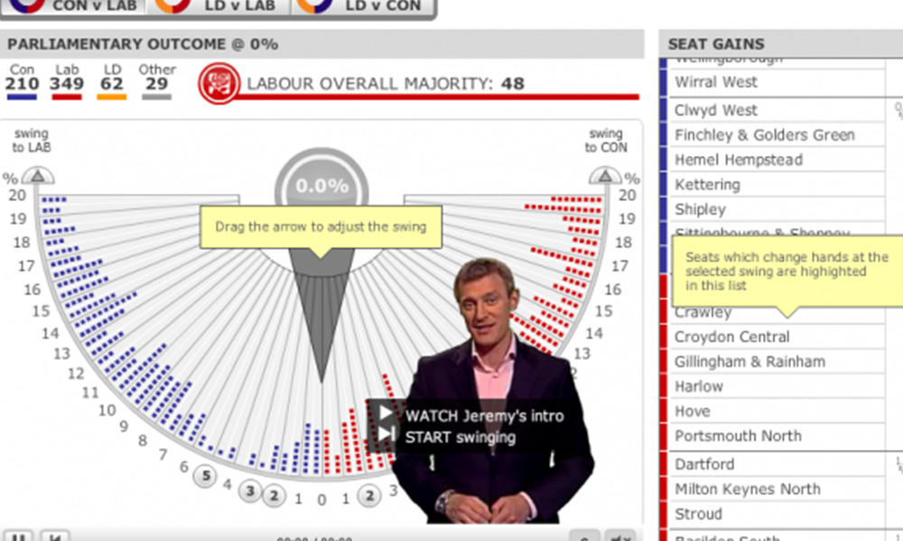
With yesterday’s announcement that the general election will take place on Thursday 6th May, the media has wasted no time in launching a glut of graphics, explanatory analytics and interactive guides to supplement their coverage. Whilst there is much focus about the internet’s role in this election, particularly with reference to the social web, in
The return of the swingometer Read More »

I wrote a post in early March entitled ‘One month in…‘ which provided some observations about the site’s progress at the end of its first month. At the time I suggested I wouldn’t be writing these every month, and I won’t do it forever, but I’m going to continue for a while at least because
Delighted that Elissa Fink, VP Marketing at Tableau Software, has taken the time to comment on my recent post ‘Tableau graph showing Gartner’s customer survey results‘ to provide some important context and explanation behind the use of this graph in their recent blog item. Elissa comments as follows: Thanks for noticing our blog post. The
Follow-up to Tableau/Gartner graph post Read More »
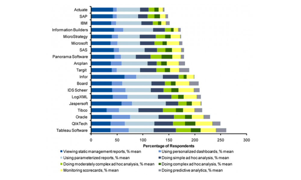
Very disappointed in Tableau for the production of this graph on their most recent blog post. I’m a big fan of their software and their credible stance on principles relating to data visualisation but, on this occasion, they’ve produced something which breaks a number of their championed best practices. The graph displayed relates to the
Tableau graph showing Gartner’s customer survey results Read More »
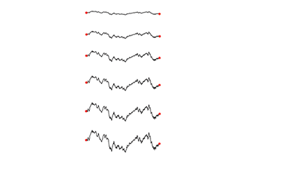
Intersting to see in the Telegraph newspaper a report about the Top 50 University spin-out companies and, in particular, the use of sparklines. The graphs themselves are embedded from a service called younoodle scores which claims to have ‘the largest-ever dynamic directory of active startups, compiled from proprietary tracking technology, a rapidly-growing community, and several
Top 50 University spin-out companies | Sparklines Read More »

I’m currently making a few cosmetic changes to the site, refining the header and some of the WordPress templates , developing a logo, installing a range of plugins to enhance the usability of the site etc. I have also buckled under the weight of demand (a whole 3 requests) to set up an accompanying Visualising Data
Site changes & Facebook page Read More »
Fine tune Design of Nothing for Utrecht event
Improving an iPhone ‘My Account’ app design: Reworking part 2 Read More »

A few weeks ago I posted some screenshots from the O2 ‘My Account’ app for the iPhone. I suggested that the design could be much improved in order to increase the efficiency in the use of space and also make better use of the opportunity to provide valuable account analysis. At the time I promised
Improving an iPhone ‘My Account’ app design: Reworking part 1 Read More »
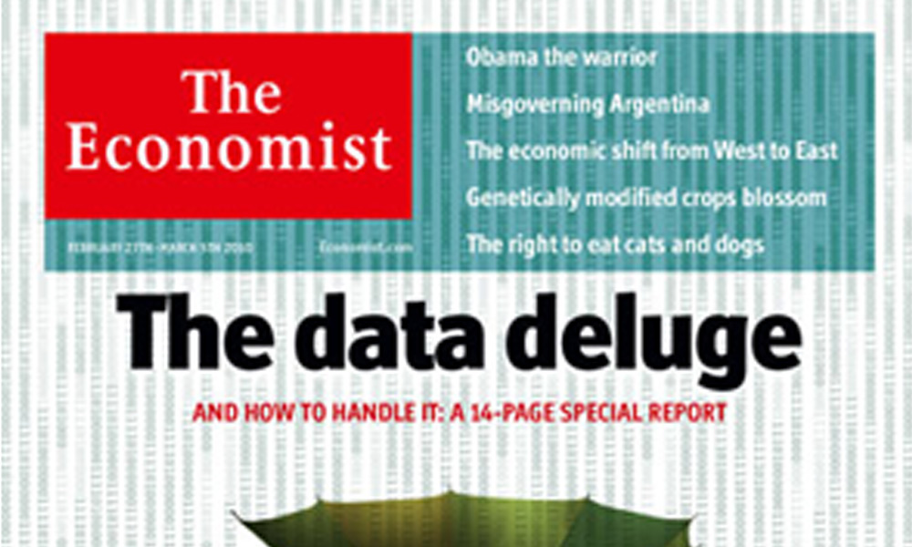
Providing some fantastic contextual information about the value of skills and services like data visualisation, the 27th February edition of The Ecomomist focuses on information overload. The front cover and leader column explore ‘The data deluge’ and inside there is a a 14-page special report specifically on managing information. This content is accessible only on
The Economist | The data deluge Read More »